Il Castelletto Logo & Brand Guidelines
In early 2018, I was approached by a friend of the restaurant who was redesigning Il Castelletto's website in an attempt to drive traffic and interest.
I was asked to create a new brand for the restaurant that could be implemented online. The work I was asked to do consisted of creating a new logo, brand guidelines document, flyers and menus.
Before
I began by looking at the existing visual brand Il Castelletto had been using. The use of typefaces, logos and colours were all very inconsistent across print and digital. Their logo struck me as being quite dated and not necessarily one that you would associate with authentic Italian dining.
I worked with the restaurant to identify their core beliefs and aims. How did they see themselves? What messages were they trying to convey to people?
We identified that Il Castelletto aspired to be more like brands such as Franco Manca and Zizzi's. They liked the playful, friendly nature of Franco Manca's visual brand and the striking website of Zizzi's. Once we'd created some mood boards, it was clear to see that what was most important to Il Castelletto was that they were perceived as serving simple, honest Italian food in a friendly, informal atmosphere.
They also told me that they wanted to appeal to a younger theatre-going audience, which made perfect sense given the proximity of the restaurant to some of the West-End's most famous theatres.
Menu
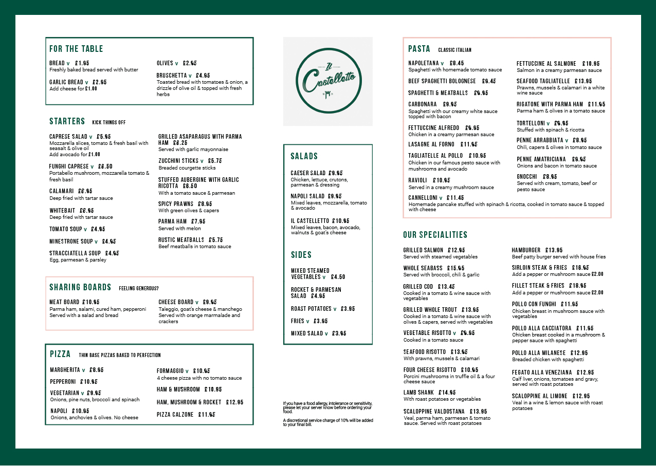
The familiar problem of inconsistency was present in the old menu, too. The menu used assets and typefaces that didn't appear in other print documents I'd seen, such as the flyer. I felt that the menu items weren't the most legible or logically organised and the structure and layout could improved.
By far the biggest challenge I was faced with when it came to the menu was the number of dishes the restaurant sold. The menu is extensive but it wasn't within my remit to recommend the restaurant refine their dish list. It was really important that I keep the food choices the same but reorganised how they were visually presented.
After
Brand guidelines
You can't create a brand without a clear sense of direction.
The brand guidelines include a logo set, with definitions on how and where each one should be used, a set of brand colours and primary and secondary typefaces.
I wanted to make a subtle reference to those popular Italian colours. Green, white and red. I chose a dark green, light grey and pastel pink to give the site and menus an authentic Italian feel, without being too cliché.
Menus
It was really important to the owners of the restaurant that their staff would no longer have to hand out multiple menus to their customers. I designed an A3 landscape menu with the full food listings on the front and a wine list on the back.
In line with the restaurant's desire to appeal to a younger, less tourist-focussed audience, I've made the copy exclusively English. I've changed the names of some of the dishes to subtly reflect the shift towards English and used fashionable terms like "thin base pizzas" and "to kick things off" to draw the eye and inject some personality.
Flyer
This flyer design was for the staff to hand out at the British Museum, to advertise the lunch offers at Il Castelletto. I brought the flyer in line with the rest of the visual assets by using the brand colours and typeface. I used authentic pictures of the food served at the restaurant and made them the prominent feature of the back of the two sided flyer. To provide something eye-catching, I coined the phrase "Italy comes to London". The idea of this strapline was to provide a bold statement of intent.


